Every once in awhile Fox News gets called out for a flawed infographic–a pie chart with numbers that don’t add up, a map with countries on the wrong continents, what have you. I found myself wishing someone would put them all in one place and then I figured I may as well do it. For hilarious commentary on various Fox News antics, go here. On the infographic front, here’s what I’ve found so far. Please send me any that I’ve missed!
1. Map showing Egypt in the Middle East

2. Video of Wisconsin … with Palm Trees
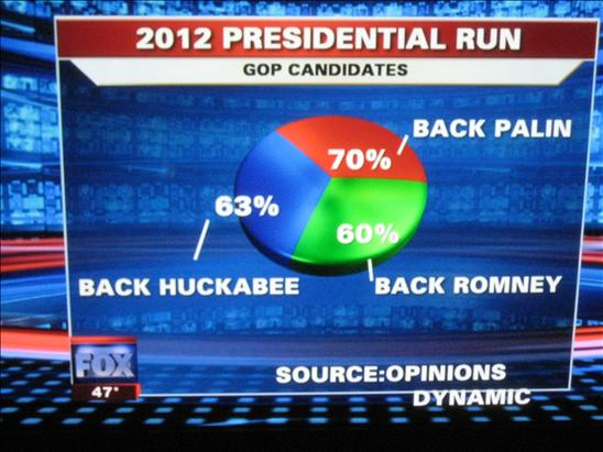
3. Poll Results that Add Up to 193% of Voters
4. A Look at What Goldman Sachs’ CEO Likes to Listen to at the Gym (this during the financial meltdown, mind you)

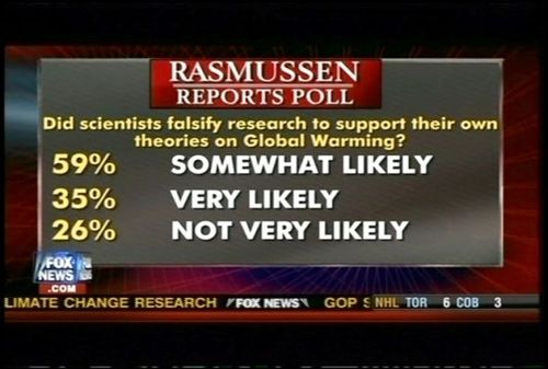
5. 120% of People Had Something to Say About Data on Climate Change – Also Fox News Pundits managed to turn 59% into “almost 100%” (watch video here).
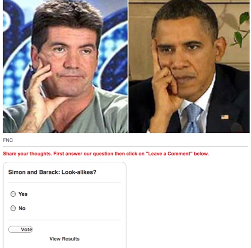
6. The Awesome Obama-Simon Cowell Lookalike Poll
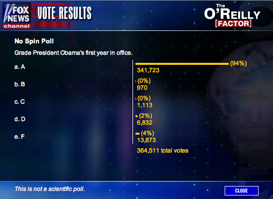
7. An Admittedly Unscientific Poll in which 1,113 Voters Are Considered 0%
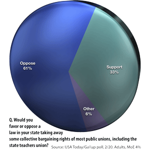
8. Gallup Poll Results Flip-Flopped to Show Americans as Being Against Collective Bargaining
Here’s what Fox ran (the “False” comes from DailyKos):

Here’s the actual polling data:
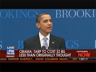
9. Caption on Obama’s Speech about TARP Costing $200 Billion Less Lists It as Being “$2 Billion Less”. Where Did that $198 Billion Go, Fox News?


7 Comments
Awesome! This is great. Keep it up.
Tumblr-ing this now!
#3 is from a local Fox station, not Fox News, so it doesn’t really belong on this list… other than that, good job!
So what’s the issue with #7? 1,000 out of 300,000 does indeed round to 0%?